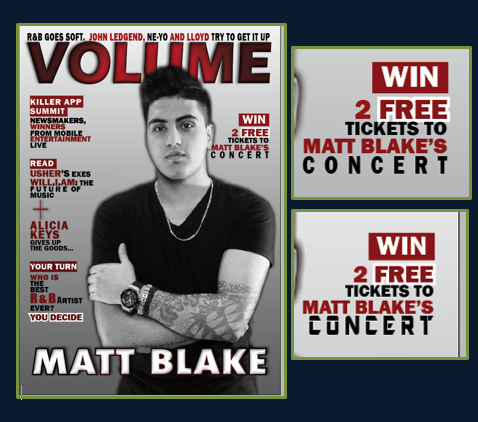
In this screen shot I am showing
how I have added the final cover line, pull out quote and adjusted a few
features. In terms of the final cover line I have followed the
same pattern as my previous one. This is because I want
everything to be consistent, professional and not too busy. I stared
by making the word 'win' as the sub-heading in order to attract my
target audience, as they are able to get something for
free which most my target audience where interested in. I found
out this through the survey I conducted. I decided on making the feature
that the audience win is 2 free tickets to Matt Blake's concert
because he is the central focus of the magazine. This is because he
is on the image for the front cover, contents page and cover
story is about him. Therefore the people who are going to buy this magazine will
need to be fans of Matt Blake as most of the magazine is about him. I also made
the word 'Free' bigger and bolder by adding the white stroke, the
same as the previous cover line I did. I decided this word was one of the
important words because as soon as the viewer see's there is something to win
or free they are more likely to approach it. I know this
because through the survey I conducted one of my questions asked whether a free
CD or any other free feature will enable them to want to buy
the magazine more, and most of my target audience said yes.
However, I could not include a free CD because none of R&B magazine had
this feature included. Therefore I will need to follow the codes and
conventions. But at the same time I wanted to please my target audience and
give them the best possible magazine that meets their needs. So for that reason
I decided to add something that will enable my
target audience to engage with the magazine, which I came
up with the following cover line. I also made the word 'concert' bigger and
added kerning to it because I also want it to stand out, as my
target audience are young people who like to party and go out. Adding
the kerning will enable them to read it carefully. It also looks good as the
name of the artist is right at the top placed on top of the word concert which
makes it related to each other and looks nice. At first I
was planning to make the font different as well to give in
more importance and will stand out against the rest of the
text. However, I changed this and kept the font the same because
I remembered I needed to follow the convention of an R&B
magazine which is not to go over maximum of 3 fonts. The top two
screen shots show how it was before and the bottom two shows how
I changed it and made it the same. The last screen shot is a zoom in
of what I added. As seen it looks a lot more professional as the
font is consistent throughout.


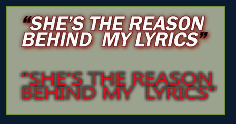 I first started off by coming up with different
pull quotes I could use. While thinking I had to keep in mind
the quote I will pick out I will need to be able to use it when
it comes to creating the double page spread. I came up with many different
pull quotes however I then picked the top one which I liked
the most. I then began to design the
pull quote in away which will suit with my
scheme and it will stand out at the same time. I designed many
different once and then picked my top two. The first one I made the inside
white, with a very thin burgundy stroke and a lighter burgundy shadow.
This is because it really brings out the text, making it stand out against the
background. I also decided to make it white because the white
colour emphasises importance of the text, as I
have only used white for the very important features such
as main cover line. For the quotation marks I had them
in black but same stroke and shadow as
this follows the pattern I have been doing for my cover lines,
but in different colours. I added these features by going on the
'object' category and clicking o effects which will give me many
different features I could use and add to my text. In terms of font I
choose the 'Franklin Gothic Demi' which is the same as my other cover lines, I
didn't want to use a different font because the key convention of R&B
magazine is not to use too many fonts and make the front cover too busy. I also
like this font because it is bold and doesn't have serif which
is professional, basic and easy to read.
I first started off by coming up with different
pull quotes I could use. While thinking I had to keep in mind
the quote I will pick out I will need to be able to use it when
it comes to creating the double page spread. I came up with many different
pull quotes however I then picked the top one which I liked
the most. I then began to design the
pull quote in away which will suit with my
scheme and it will stand out at the same time. I designed many
different once and then picked my top two. The first one I made the inside
white, with a very thin burgundy stroke and a lighter burgundy shadow.
This is because it really brings out the text, making it stand out against the
background. I also decided to make it white because the white
colour emphasises importance of the text, as I
have only used white for the very important features such
as main cover line. For the quotation marks I had them
in black but same stroke and shadow as
this follows the pattern I have been doing for my cover lines,
but in different colours. I added these features by going on the
'object' category and clicking o effects which will give me many
different features I could use and add to my text. In terms of font I
choose the 'Franklin Gothic Demi' which is the same as my other cover lines, I
didn't want to use a different font because the key convention of R&B
magazine is not to use too many fonts and make the front cover too busy. I also
like this font because it is bold and doesn't have serif which
is professional, basic and easy to read. 
The second pull quote I designed it in the same process effects and features, however different colour and font.The font I picked for this one is simple very simple and thin. The colour is bright red as this makes it stand out against the background and all other cover lines. I added a black shadow so the red colour doesn't look to bright and ruins the colour scheme. Overall the one that I liked most is the top one because it looks a lot similar and goes more with my colour scheme. It also has the same font as my over cover lines. The top one also follows the conventions of an R&B magazine a lot more than the second one. Therefore I will now be placing that one on my front cover.

In this screen shot shows the final touches that I added to my magazine, such as the barcode, price, issue number and adjusting the text just to make sure the sides are symmetrical and everything is placed in the correct place. As seen through screen shot one I kept adjusting the text and adding more rules to make sure the sides are symmetrical as this is important in order for the magazine to look professional.I also made sure I kept the right amount of space at the top of the page between the skyline and end of the page. As through R&B magazines they didn't have a large amount of space, same goes for the bottom. I also kept all the cover line after each other because I have seen this on R&B magazines it is also neat and the cover lines aren't all over the place and don't go over the image. Except for the main cover line, but doesn't take up too much or the central parts. I placed the issue number underneath the masthead because this is where I have seen it being placed on the R&B magazines. Therefore I have to follow this convention in order for the audience not to be confused as they are used to seeing it in the same place. The colour I decided to make it is black because I don't want it to ruin the masthead or take away the focus. Therefore making the colour dark will keep it simple and won't stand out a lot. As for the font I made it the same as the cover lines because I didn't want to use too many fonts as I mentioned before. In terms of barcode and price I placed them at the bottom of the page. As through my research I saw all R&B magazines placing the barcode and price at the bottom on the right or left depending on the space available. As a case of mine I decided to place it side ways up, at the bottom on the right side of the page, with the price underneath. The price and barcode need to be together when it comes to a magazine. I decided to place it on the right side and not the left because it ruins the text above and may distract the audience therefore I decided to place on the other side as its empty. The colour I used for the price is black in the same handwriting as all the other text, keeping is simple and neat.
No comments:
Post a Comment