Early Stages of Construction - Contents page
I am now starting to show the process of creating my contents page.

First I started of by making the background on Photoshop placing with the image and then I will move the background and image both onto InDesign. I first started of by selecting the 'gradient tool' making a box the fits perfectly on top the whole page. I then created a new gradient and selected the two colours I want to blend in together, which are grey and white. After this I then used the gradient tool to make a line across the page as seen in screen shot two. This will enable me to choose how I want the two colours to blend in together. I am going to make the top part grey and then started getting lighter into white. I did this because these two colours will go best with the image and will follow my colour scheme. It will also enable the text to stand out as the background is a little darker a the top. I the used the 'T' (Text) tool' to type up a V. This represents the name of the magazine. The font I choose is 'Eras bold' which is the same as the one I used to create the masthead. This is consistent and bold. I have seen an R&B magazine do this, which I got the idea from. It is useful as it allows the audience to familiarise themselves with the name, cause as soon as they see it they will think what the V represents and realise it's the name of the magazine (Volume). When I finished doing this I then changed the opacity of the V as I didn't want it to be that bold. This is because it may distract the audience and the text won;t be easily visible.
 When I was done creating the background I just needed to place the image of the artist which I did. Now I can place the full image onto InDesign, which is show through the next screen shot. I done this by going on 'file', 'Place' and then selecting the image from my files.
To begin with I adding the draft of my contents page layout side by side with the InDesign page. This is so I have a clear understanding of which features are going to go where. It also helped me insert
the Alignment lines. This is will enable me to make sure everything is positioned correctly, neatly and not all over the place. The first thing I need to do is create the title of the contents page. Therefore before doing this I made sure I looked at a few R&B contents pages that I researched on already before just to make sure I have the prefect idea on what design I will creating, this will be less time consuming for me as I won't I have to create many designs. The first contents page is one of the R&B designs of a contents page, however this is not the one I am following or will be creating a similar one to it. I am only using it in order to look at the design of the title. The second contents page design is the same to the one I want to create. As I have planned this from before while I was doing my research on contents pages. This is only a recap to make sure I do not miss out any key features. Even though these to are totally different magazine however they both have similar title design, which is bold with no serif on the font. Therefor the design that I will going for in terms of title the design that I am going for is bold and simply this is because it follows the codes and conventions of an R&B magazine and also relates the theme of my magazine.
When I was done creating the background I just needed to place the image of the artist which I did. Now I can place the full image onto InDesign, which is show through the next screen shot. I done this by going on 'file', 'Place' and then selecting the image from my files.
To begin with I adding the draft of my contents page layout side by side with the InDesign page. This is so I have a clear understanding of which features are going to go where. It also helped me insert
the Alignment lines. This is will enable me to make sure everything is positioned correctly, neatly and not all over the place. The first thing I need to do is create the title of the contents page. Therefore before doing this I made sure I looked at a few R&B contents pages that I researched on already before just to make sure I have the prefect idea on what design I will creating, this will be less time consuming for me as I won't I have to create many designs. The first contents page is one of the R&B designs of a contents page, however this is not the one I am following or will be creating a similar one to it. I am only using it in order to look at the design of the title. The second contents page design is the same to the one I want to create. As I have planned this from before while I was doing my research on contents pages. This is only a recap to make sure I do not miss out any key features. Even though these to are totally different magazine however they both have similar title design, which is bold with no serif on the font. Therefor the design that I will going for in terms of title the design that I am going for is bold and simply this is because it follows the codes and conventions of an R&B magazine and also relates the theme of my magazine.
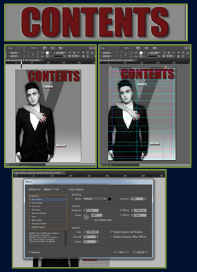
This the design of the title for the contents page that I will be using. The font that I have chosen is 'Impact' this is because it is consistent as I have used it in my front cover. It's also bold and stands out a lot. It is also a San serif font, which relates to R&B as it has bold and strong edges. The colour I went for is burgundy this is because again follow the house colour of my magazine, it also goes really well with the heart on the image, which contrasts together. The letters are in capital as through my research all R&B and most of other music genres had their title in full capital letters. This emphasises the boldness of the magazine and again makes it stand out, it is also a convention which I had to follow. When I finished choosing the font and colour I then started to add effects, as I do to most of my really important text to make them look bolder. The last screen shot shows the effects which were available that I could use. I added a black shadow, inner shadow and outer glow to create this professional R&B contents page title. I did not want the title to go all the way across the width of the page because it did not look very nice. When I was done editing it I used the alignment lines to help place it in the correct place. I the moved on to creating the sub-headings 'Features' and 'Reviews'. I made them white in the font 'Impact' I chose this for the same reasons I mentioned before. I didn't change much with this I just added a shadow and increased the noise a little to make it have a texture and sharp, relating to R&B. Underneath both sub-headings I added a burgundy line to make them stand out a little more and this also emphaises they are important as its underlined. I also use the alignment lines to place them in the correct place.

 When I was done creating the background I just needed to place the image of the artist which I did. Now I can place the full image onto InDesign, which is show through the next screen shot. I done this by going on 'file', 'Place' and then selecting the image from my files.

No comments:
Post a Comment