I'm going to be showing the stages of how I began to create my double page spread. I will be showing the steps of how I developed it, why I choose to design and place each feature in such and way, with real R&B magazine examples to back up everything I have decided on and how I made it. The process is the same as my other two pages.

I first started by creating my double page spread. I did this by applying all the sizes an features I need for a Normal page and then on the side of the program InDesign I clicked on pages which allowed me to have a double page spread. I then placed my draft layout beside the page I created on InDiesgn, this is too make sure I know where I will be posting everything. It also helped my created the alignments lines to help me post everything in the correct place and in line. This will enable my double page spread to look professional and neat. As if I placed everything anywhere this will be difficult to read and unorganized It was also help me finish quicker as I don't need to figure out where to place everything.
 I decided on this layout because through my research on R&B double page spread I have seen my of them in this specific layout. This is an example of the similar layout that I will be doing. However the title be large some going on to the image side. The background will be very simple as I want the text to be read and seen easily. Another key convention is that the image needs to relate to the article written and this is what I will be doing. As I have already decided what my article is going to be about and from that I began to create and shoot my images. I have done this for all my image I made sure they all relate to R&B and the message I'm trying to get across. As the first thing the audience will see is the image, and this needs to attract them to read or buying the magazine.
 After I got everything ready I can now start creating my background. I did this in the same way as I have explained it previously. I first started by taking the 'gradient tool' select the whole page, choosing the colour I want. Which are white grey and seen, I need bled it in the way I want (grey from the bottom going up to white. I choose this because it's simple allows the text to stand out and links to my other two pages. Screen shot two shows be select the file I need, in this case it's my image. I placed it where I want it to be using the rule measurements. I choose to create this image because it links to the interview I will be writing. The interview is about Matt Blake's (artist) new album. He reveals a few secrets about an unknown women he loves and his future plans with her. Therefore I created this image because the figure of the legs represent a women. However the face isn't shown because the interviewer and audience do not know who she is. Representing that there's a women but her identity is hidden. It also relates to R&B as women are normal begin objectified, linking to the theory of John Berger 'Men look, women appear'. As the man is sat where the women is walking towards him with part of her skin showing.
 This is an exciting example of R&B title and sub-heading. As you can see the masthead is bold and stand out instantly the page is open. I will be creating something similar as I want it stand out, but I will give it my own unique touch.Underneath the title there is a short sub-heading summing up what the whole article is about. I have seen this in many R&B double page spreads and other music genres. There I believe this is a convention I will need to follow. Therefore for my double page spread I will be adding a sub-heading to sum out my article. This will need to be placed straight underneath the title as viewer will need to read it first. This is also a convention I am going to follow, to allow me to produce a successful R&B double page spread.

I first began my thinking of and title and designing it. I came up with many different titles such as 'King of R&B REVEALS', however I decided to go for 'SEX, SECRETS AND SONGS' because this short snappy and it's a alliteration. This will enable the audience to remember it and will grab their attention instantly. It also follows the conventions as it needs to be short and relating to the article. It relates to the article as it's about love and sex is associated with love. For the word 'secrets' the artist (Matt Blake) will be revealing a few secrets and 'songs' relates to the whole magazine and article as it's talking about his latest R&B single. I find this title really effective and actually. Also it does not contain too much information, making the audience curious and want to find what its about. In terms of design I choose the font 'Impact' as I have been using this throughout my pages. It's bold and San serif making it easy to read and emphasising the R&B music has being hard and bold. I made the key word in burgundy as I need them to stand out. I keep the them of colours the same, as they are my house style. For the comma and word 'and' I made then in black as they aren't very important. I added a few effects such as drop shadow, inner glow etc. I done this in the same way as I explained it many times during my other pages. I made the shadow in the colour gold, because I want the double page spread to stand out a little and have something unique to the other too pages. I did not want to add to much colour but just enough to make it look a little different, but still relating to my house style and other pages. I chose the colour golf because this relates to R&B strongly, as they are associated with chains, having money and gold. This relates back to why I made my model wear and chain and necklace with a skull on it with diamonds. As R&B artist and listeners are into elements like this. Also my target audience are young people who love going out and money. I also played around with the levels of the letters (height, width and spaces). When I was done creating my title I moved on to coming up with a sub-heading. I came up with two different typography for the sub-heading. First one I made the whole text in black but the words 'partner, secrets and songs' in capital letters in the colour gold. This is because i felt like these word related to the three words of the title.
 Partner = sex. secrets= secrets and songs = songs. I also changed the font to make it stand out eve more and emphasises the importance if the words. The second one I made it little bit like a banner to make it really stand out and allow the audience to read it first. I made the background black with white text. I added ellipses to make it more extreme and create a feeling of curiousness. At the bottom I need made the sentence 'no face shown' in capitals in the colour gold. This is because I wanted this part of the sub-heading to be important and stand out. The font I choose is Agency FB. At the end I decided to for the second typography design because I didn't want to repeat my self as it was very similar to the title, and the sub-heading is meant to give a little more information about the article. Therefore by making the 'no face shown' the important bit the audience will know there is something to do with identity relating back to the main image. These to screen shots on the side show how the double page spread looks after I have placed them in the correct place.

For the start go by double page spread I'm going to making the first letter big as seen through these two R&B double page spread. Depending on the design and which looks better with my layout I decided whether I will make it bold or curvy. However just looking through these examples I kind of like the curvy one, but I will still experiment. For the paragraphs I will be making the paragraphs justified with last line alignment left. As this will make sure everything is in line together, making it easy to read and the audience will know where to start from next. I will be making sure I use I have used some techniques that I have learnt throughout my research to improve the language as well as interest and attract the audience. I will make sure there is not grammatical mistakes and I use many techniques.

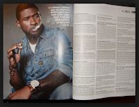
In these screen shots I am going the process of me developing my double page spread and adding the interview that I ave written. I first started of my adding a short introduction about Matt Blake and his career. As I have seen all double page spreads including an introduction to began with. After placing everything using the alignment lines to help me make sure everything is straight. I then started to experiment with what font to make the first letter. I made it first bold in burgundy colour. However I did not like it as I felt like it was too bold and squashed together. Therefore I then made it curvy, which I really liked it, therefore I kept it. For the font of the text I made it 'Calibri' as it's a sans serif font. This makes the writing simple and much easier to read as there's a large amount of text and the audience need to be able to read it quickly and easily. For the size I made sure it's not more than 12pt as through my research the most it goes up to is 13pt. This is because 14pt and above is to big for a double age spread. I kept the font the same though out. However for the questions I just made the colour different, so the audience will see it easily and be able to tell when the next question starts. I also made sure the paragraphs are in cloumns as through my research all R&B double spreads the paragraphs are layout are in columns. I finally used the alignment lines to help me place it in the correct place.

 I decided on this layout because through my research on R&B double page spread I have seen my of them in this specific layout. This is an example of the similar layout that I will be doing. However the title be large some going on to the image side. The background will be very simple as I want the text to be read and seen easily. Another key convention is that the image needs to relate to the article written and this is what I will be doing. As I have already decided what my article is going to be about and from that I began to create and shoot my images. I have done this for all my image I made sure they all relate to R&B and the message I'm trying to get across. As the first thing the audience will see is the image, and this needs to attract them to read or buying the magazine.
 After I got everything ready I can now start creating my background. I did this in the same way as I have explained it previously. I first started by taking the 'gradient tool' select the whole page, choosing the colour I want. Which are white grey and seen, I need bled it in the way I want (grey from the bottom going up to white. I choose this because it's simple allows the text to stand out and links to my other two pages. Screen shot two shows be select the file I need, in this case it's my image. I placed it where I want it to be using the rule measurements. I choose to create this image because it links to the interview I will be writing. The interview is about Matt Blake's (artist) new album. He reveals a few secrets about an unknown women he loves and his future plans with her. Therefore I created this image because the figure of the legs represent a women. However the face isn't shown because the interviewer and audience do not know who she is. Representing that there's a women but her identity is hidden. It also relates to R&B as women are normal begin objectified, linking to the theory of John Berger 'Men look, women appear'. As the man is sat where the women is walking towards him with part of her skin showing.
 Partner = sex. secrets= secrets and songs = songs. I also changed the font to make it stand out eve more and emphasises the importance if the words. The second one I made it little bit like a banner to make it really stand out and allow the audience to read it first. I made the background black with white text. I added ellipses to make it more extreme and create a feeling of curiousness. At the bottom I need made the sentence 'no face shown' in capitals in the colour gold. This is because I wanted this part of the sub-heading to be important and stand out. The font I choose is Agency FB. At the end I decided to for the second typography design because I didn't want to repeat my self as it was very similar to the title, and the sub-heading is meant to give a little more information about the article. Therefore by making the 'no face shown' the important bit the audience will know there is something to do with identity relating back to the main image. These to screen shots on the side show how the double page spread looks after I have placed them in the correct place.
No comments:
Post a Comment