HOW DID YOU ATTRACT YOUR AUDIENCE/ADDRESS YOUR AUDIENCE?


In addition an important feature that I have included in my double page, which will attract my audience is the use of language, which I referred back to existing magazine such as Vibe or Billboard. For example following the separation of the page, image on one side and text on the other, also the use of alternation for the title, which definitely attracts the audience to stop and look at it especially because it relates to the artist as seen from the image. For the subheading I have also Added a sort of highlight white for the text and black box, making the text stand out, as for the main part 'no face shown' it is in gold making it really stand out and grab the audience attention. Also creates a feeling of curiousness to find out more and what it is about. The contrast between the font and the background would definitely bring the readers attention. Another very eye catchy element that would attract the audience attention is the use of pull quote which is placed directly within the text. The use of language within the pull quote "she's the reason behind my lyrics" is very strong and confident. I believe this would attract the audience as they would want to find out more about what he is saying in the interview. It makes the readers think he is a strong and confident character, and this is how the audience might want to be viewed. Also due to the design and font it makes it stand out even more and therefore grabs the audience attention.
Moreover, for my double page spread and front cover I tried to use personal pronouns as this is a common language technique used to attract readers attention. For example, 'YOU DECIDED' . This would definitely grab the readers attention as the magazine content is directly aimed at the reader, which means they would feel more engaged with the magazine as they are a part of it.
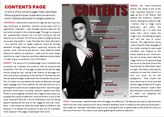
Referring back to my contents page I have also used a few more techniques to grab my audience attention. The contrasting and simplistic colour scheme which really empahises the use of good aesthetics of the page. Also it makes it much easier for the reader to read the features, which means it would attract them to read the page. In addition, in this page is a division of the contents features, meaning is one of the common codes and conventions found within a contents page magazine. For surely this would attract the audience as again it would allow them to read it faster and easily. Allowing them to easily find what they want under each heading. This is supported due to large amount of pages placed on the side of the features, enabling the audience to easily find a particular page. To make it stand out even more I made the title in capital letters using a bold font in the colour burgundy which standout very well against the background, grey.
To conclude, I feel that with the various techniques I have used, including the features which were inspired by the answers I received form my survey and form existing magazines. Also the images and the language I used, I have managed to produce a professional magazine. This is because most of this was conventions of music magazines I have followed to produce a sophisticated outcome. I feel that I have managed to create this looking at my product which my audience would believe and buy the magazine.
No comments:
Post a Comment