Saturday 30 April 2016

Evaluation 5

HOW DID YOU ATTRACT YOUR AUDIENCE/ADDRESS YOUR AUDIENCE?


In addition an important feature that I have included in my double page, which will attract my audience is the use of language, which I referred back to existing magazine such as Vibe or Billboard. For example following the separation of the page, image on one side and text on the other, also the use of alternation for the title, which definitely attracts the audience to stop and look at it especially because it relates to the artist as seen from the image. For the subheading I have also Added a sort of highlight white for the text and black box, making the text stand out, as for the main part 'no face shown' it is in gold making it really stand out and grab the audience attention. Also creates a feeling of curiousness to find out more and what it is about. The contrast between the font and the background would definitely bring the readers attention. Another very eye catchy element that would attract the audience attention is the use of pull quote which is placed directly within the text. The use of language within the pull quote "she's the reason behind my lyrics" is very strong and confident. I believe this would attract the audience as they would want to find out more about what he is saying in the interview. It makes the readers think he is a strong and confident character, and this is how the audience might want to be viewed.  Also due to the design and font it makes it stand out even more and therefore grabs the audience attention. 

Moreover, for my double page spread and front cover I tried to use personal pronouns as this is a common language technique used to attract readers attention. For example, 'YOU DECIDED' . This would definitely grab the readers attention as the magazine content is directly aimed at the reader, which means they would feel more engaged with the magazine as they are a part of it. 

Referring back to my contents page I have also used a few more techniques to grab my audience attention. The contrasting and simplistic colour scheme which really empahises the use of good aesthetics of the page. Also it makes it much easier for the reader to read the features, which means it would attract them to read the page. In addition, in this page is a division of the contents features, meaning is one of the common codes and conventions found within a contents page magazine. For surely this would attract the audience as again it would allow them to read it faster and easily. Allowing them to easily find what they want under each heading. This is supported due to large amount of pages placed on the side of the features, enabling the audience to easily find a particular page. To make it stand out even more I made the title in capital letters using a bold font in the colour burgundy which standout very well against the background, grey.

To conclude, I feel that with the various techniques I have used, including the features which were inspired by the answers I received form my survey and form existing magazines. Also the images and the language I used, I have managed to produce a professional magazine. This is because most of this was conventions of music magazines I have followed to produce a sophisticated outcome. I feel that I have managed to create this looking at my product which my audience would believe and buy the magazine.

Thursday 28 April 2016

Evaluation 4

WHO WOULD BE THE AUDIENCE FOR YOUR MEDIA PRODUCT?

The audio for evaluation 4

I have produced an audience analysis for my magazine, to identify who my magazine relates to most. With this information, it was much simpler for me when constructing my music magazine together, which enabled me to appeal to my target audience more successfully, as I will be discussing in more detail in my text evaluation. Most of my decisions for my magazine came from the respondents to my survey, which gave me some stimulus for thus particular social group. It also gave me a clear idea of what my target audience like and prefer within the magazine such as the different elements and style.

As I have already included the Market segmentation, here I will be going into more detail.
Market Segmentation:
Demographic 
My magazine is mainly aimed towards people around the ages of 16-24, both equal genders therefore 50/50. As see through my questionnaire the gender of respondents where around the same amount and the age I range I chose is also the majority. This is similar to Vibe magazine. My house style also represents both genders as the colours burgundy, black and white are liked by both genders. This is also evidenced in my questionnaire as one of my questions was what colours they mostly liked, and the majority picked dark colours which are the following that I have used for my house style. The typography also supports that my magazine is aimed at both genders. They are going to be students and semi-professionals, middle working class to lower. They will need to have some sort of disposable income and will be able to afford to pay £2.99 per month for my magazine. In terms of the general registrar scale, they are likely to be within the BCD sector. They will have semi-professional jobs as I mentioned before, for example cashier, junior managers through to plumbers, etc. They will also be in part time education or employment. They need to educated, will also have a particular interest in music, especially in the artists and music I have mentioned in my magazine. Some of which are Rihanna, Usher, Beyonce, Chris Brown, Justin Timerlake, Trey Songz, Alicia Keys, The weekend, Nicik Minaj, John Ledgend and much more similar R&B artists. 
Geographic
My magazine is generally aimed around the UK and bigger cities such as London. This is because most of the concerts, content, live performances and elements included in my magazine are about the UK and will be occurring in the large cities and the UK. Also the places and venues these performances will be in my target audience will definitely be familiar with and know where they are. Not only that but most of the artist I have included in my magazine, which I have previously mentioned, such as Usher and Rihanna etc, have a heavy influence within the UK and R&B lovers. In addition, these artist are mainly appealing to my target audience, this is because they are more of the newer and younger generation, and their experimentation with R&B music. This way I am able o really attract and appeal to my target audience.  It will also be very easily for my target audience to get a hold of my magazine in London and larger countries, such as the UK, and attended concerts and events arraigned in these cities. I can support this through the cover line on my front cover '2 FREE tickets to Matt Blake's concert' which will be occurring in the UK, London.
Psychographic                                                                  
In terms of the psychographic, my readers will be a mic of main streamers and aspires. This is because they will have some disposable money to be able to buy my magazine per month, for £2.99, which is similar to Vibe magazine and even cheaper. I made it cheaper because through my questionnaire my target audience were only willing to pay no more than £4 therefore I had to keep lower than this. So for that reason I made it £2,99. They will also be mainstreams as they will be inspired by some popular styles or brands of clothing worn by a wide range of people. However, it is also likely that they can be explorers, as my magazines ideology is knowing up coming events and news about R&B artists. They will also be more likely to enjoy attending concerts and events as there social activity. 


Wednesday 27 April 2016

Evaluation 3

WHAT KIND OF MEDIA INSTITUTION MIGHT DISTRIBUTE YOUR MEDIA PRODUCT AND WHY?

In the researching process , I had conducted a lot of research into the different institutions and ideologies of magazines, which allows me to apply it here when choosing which media institution could distribute my media product. I have used Prezi for this evaluation as I believe it is the most suitable source to help me compare my ideas before coming to a conclusion.

Tuesday 26 April 2016

Evaluation 2

HOW DOES YOUR MEDIA PRODUCT REPRESENT PARTICULAR SOCIAL GROUP?

This is the audio for evaluation 2 
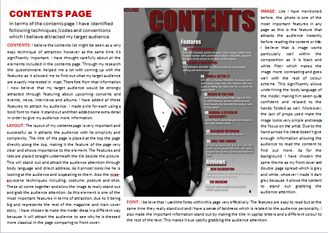
During the creation of my magazine; which is the front cover, contents page and double page spread. I made sure I include many different techniques in order for me to represent a particular social group within my product and make sure I use the codes and conventions showed within my product. My target group that I aimed to represent was general people interested in R&B music. The demographics is people aged 16 to 24 years old, which are young professionals or students, which I extracted from my research and planning. They are also really into current trends and new changing hits. My magazine is all about R&B music and I have expressed this through the house style of my magazine, which focuses on burgundy, black and white. This is taken from my research into R&B music and my questionnaire. As the majority of my target audience chose dark colours as their favourite and what attracts them most. This is one element which indicates how I have represented my social group. In terms of research Vibe magazine inspired me the most to portray the alternative music through ever element of my magazine, such as colour, contents, fonts and other features.

I used models aged 18 and 19 for my photo shoots, however for the male model I changed his aged and said he is 22 years old. This is because through my research I found that the youngest R&B singer is in the ages of 22. Therefore I could not keep his real age as this wouldn’t be realistic. So for that reason I chose a model who will look 22 years old. I did not go for an older age because my target audience are 16-24 years old, therefore they need someone who they can related to, and for the younger audience they will be able to look up to him as their idol or want to look like him.  This links to Carl rogers or Jacques Lacan‘s theory the ideal-partner, or ideal-ego. This also challenges the general stereotype of young people as delinquents or trouble. However according to Bick Hebdige’s theory, Matt Blake and the target audience of this magazine are within the ‘fun’, ‘successful’ part of the spectrum.


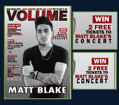
To begin with the masthead/logo of my magazine which is ‘Volume’. This instantly allows people to have an idea that this relates to audience who like loud and rhythmic music. This relates and reinforces the stereotype of young people who are very loud, with unique personalities and have just started their adult life. For example, through the medium shot his facial expressions suggest he is friendly, successful and confident within himself, which reinforces positivity within the audience. The mise-en-scene of the image also represents my social group. First through his hair style, which very on point and styled upwards, relating to the person’s interest to R&B music, also apply to my social group who can be associated with these kind of hair styles. As for costume, the model is wearing a black t-shirt, chain and bracelets which again can be associated with R&B artists. However what he is wearing can be worn in any age bringing more focus to the genre rather than specific age of the audience. Another element is the lighting, which portrays Matt in a positive light, going with the idea of him being seen as a ‘confident’ person, which the majority of young people within our modern society have personalities like. His gesture reinforces this, as his hands folded connotes he is confident and laid-back, which people, especially who listen to R&B, will tend to have personalities like this, again reinforced by the lack of props and simple costume.

The image I have used in my contents page also says a lot about the social group of my product. The model’s posture, hands in his pockets, looking directly at the camera white the woman’s hand is on his chest shows he quite confident and relaxed. These associations can be clearly linked to my social group/target audience. Also his clothing; white shirt, black blazer, black trousers, shown through the medium shot. Display the other side of R&B musicians and audience’s, as they aren’t only into comfortable and simply clothing. However it still links to the R&B style, due to the tie/bow not being there, this shows it is not too formal. Suggesting the magazine is aimed at middle class people, who like to dress casually and pertly classically but not too formal. In addition, the way in which the woman’s hand is on his chest but he is shown not to care, reinforces his confidences and ego. The lack of props such as microphones, guitars and other music instruments, relate to R&B music as these props are normal associated with rock, metal or other music genres. I supported this supported this perception of young people even further by adding appropriate features within my contents page.

My double page spread image also reinforces the social group of my product as people who are confident, fun, relaxed and assured. The model looks very relaxed and confident as he is sitting on the chair looking directly at the camera, playing the part very well, as I intended for. Whereas the woman shown through the figure of her legs, she walking towards him. But he is not interested indicate his ego and self-assurances. Which again reinforces the theory of Carl rogers or Jacques Lacan‘s. It also relates to John Bergers theory men look, women appear, linking to the R&B music and audiences. 

Another feature which shows relation to my social group is the use of language. For my magazine; front cover, contents page and double page spread, I have made sure I use different language features. For example, I have included other R&B artists which people within this particular social group would listen, such as ‘Usher’, ‘Rihanna’ and ‘Chris Brown’. This is very similar to Vibe as they often cover the artists I have mentioned within my magazine. In addition, the language techniques I have also used represents this particular social group though it’s conventional or colloquial language. For example the cover lines and pull quote I have placed on my front cover ‘killer summit app’ reflect on the type of stories and features my social group would be interested in, such as apps, entertainment and mobiles. As these features are normal associated with young people.

Also the colour scheme and house style of my magazine reflects my social group and their linking’s. As the colours have chosen ‘burgundy, black and white’ was my target audience choice. Through my survey I asked my social group what was their favourite colour and the answer was dark colour such as the following. This shows how I have represented my social group, due to the fact that I have based my magazine and house style on their liking and what represents them. Also dark and bold colours are normally associated with young people. Also the costume links very well with the way my social group dress and to other artist used in Vibe magazine.

In addition, the prices of my magazine is £2.99, I think this is a good amount compared to billboard which is £6:99. This shows that the price for my magazine isn’t too high or low, especially while considering my social group which is less likely to pay more than £4 for a magazine, I have also taken this from my survey, when asking my target audience how much they are willing to pay. This also portrays that the middle class people, both genders expect quality for reasonable price of £3.99.
Moreover, I would deliberate my social group to be at least partly educated with a high ambition to be aspire, (May be in the BCD sector). Even though I have included some partying features, but the text within the magazine balance it out.

To conclude the evaluation of my social group I came up with Market Segmentation:  


Market segmentation evaluation 2 from doaael

Many people around this age will still be experimenting with their sense of style, from their music style to their fashion style, and I think my product promotes the general style of R&B of this particular age. I made sure that my model wore clothes specific to my genre. The clothes I selected were based of the research I done previously, when looking into general styles of this particular social group. The general social group within Vibe is very similar to mine, therefore I took a lot of inspiration from this magazine. Within the presentation below of original research, it will show how I have managed to represent this particular social group, particularly through costume:


To conclude, for this task I have clearly shown a verity of methods within my product to really show how I have represented my social group. I have done this mainly though the model, mise-en-scene, facial expression, body language, lighting, colour scheme, house style and the ability to always refer back to my research into audiences within other existing, successful magazines. also taken to consideration market segregation which enabled me to identify even more aspects about the social group of my magazine. I also created an audience profile which enabled me to portray different views about potential social group. 

Sunday 24 April 2016

Evaluation 1

IN WHAT WAYS DOES YOUR MEDIA PRODUCT USE, DEVELOP OR CHALLENGE FORMS AND CONVENTIONS OF REAL MEDIA PRODUCT?

When creating my magazine, there were many forms and conventions which I had to follow, which I had researched and analysed during the researching stage of this process. By using and adding these codes and conventions to my magazine, it definitely enabled my product to look more professional, also making it more realistic to sold amongst existing magazines such as 'Vibe' or 'Billbiard' in suppliers such as WHSmith or other supermarkets. 

Friday 22 April 2016

Starting Evaluations

Now that I completed the construction of my three pages, front cover, contents page and DPS. I need to start focusing on my evaluations. This will start from Friday 22nd of April, I have already responded and evaluated some of the key information during my research, planning and construction process. Due to this it will be easier for me to do piece of work where I will be evaluating different aspects learned throughout the course. I am planning to use, Prezi, Slide-Share, Sound Cloud for audio and more. This will need to be done by the Friday 29th of April. 

COMPLETE Front cover, Contents and Double page spread

FRONT COVER


CONTENTS PAGE


 DOUBLE PAGE SPREAD 


Thursday 21 April 2016

Final stages of Construction - Double page spread

I am continuing my final stages for double page spread development.

Here is an example of an R&B double page spread that included a pull quote. As seen the pull quote is placed between the the next, in big bold font. This is to grab the audience attention and allow them to approach and read the article. It will also make them want to read the article in order to find what this pull quote is about. I will be including this in my double page spread, and will be showing it in the text screen shots. This pull quote is quite long, however in my other research I found that the pull quote needs to be short in order to engage the audience and not give them too much information so they can approach and read the article to find out more. 

I came up with three different designs. The first one I picked a font that looks a little bit like handwriting and made it italic. This is because I wanted I wanted it too like it was written down. I also added a few effects such as a shadow to make it stand out against the rest of the text. I made the colour of the shadow orange because I wanted a colour that would stand out against the background and I haven't used yet. For the second one I used 'Eras bold' font, which is the same as my masthead, I like it because it is bold which goes with the theme and R&B style. I also made it italic because I didn't want it to blend in withe the rest of the text, needed it to stand out a bit more. It also emphasises that it's been said by someone. As through my research italic text make suggest something is being said or it's a name. The colour I choose black with I gold shadow. This relates to the title and sub-heading making the theme come together. I did not choose to add a stroke because it will make it too harsh, whereas the shadow is more light. For my last design I used the same font as the second but I changed the colour. I made the colour burgundy with a black shadow. I made this as I wanted to see how it look with it being in the center of black text. I though it will also emphasises that importance as one the questions are in burgundy as the rest of the text is in black. The one I picked at the end and decided to choose is the second one. This is because I believe it is the most attractive and stands out the most. It also allows the theme colours to all come together. Not only that but the colours I used really show and represents the importance of the text. This is because I only used it for the sub-heading. One last thing I need to mention is that I decided to make the size 24pt because I wanted it to be bigger than the rest of the text so it grabs the audience attention. I also decided on placing it in the centre of the text as I have seen R&B magazines placing it in the same place, seen through the screen shot above. I also added the a few more questions. 


I have added this because it is a little hard to read on the screen shots.
In these screen shots I'm showing the final outcome and the finishing touches that I added. First I finished off adding the final questions and answers. I also made sure that all the text is lined up perfectly using the alignment lines. I then added the numbers of the pages and the CD album that I created to go with the article. I placed it at the top of the left page on the side and underneath it small text saying 'CD Album' just make sure the audience what it is. I decided it place it there because I stands out against the background and doesn't overlap the main image. I also added effects to it just as shadow. I did this in the same process I have mentioned before. The colour of the text is black with burgundy shadow, using the font 'Calibri', which is the same as my text. I did not want to use any other font because it will then make the page have too many fonts which is unprofessional. The text is also not very important therefore don't need anything to make it stand out. I made the size of the album small because I didn't want it to seem as if I am advertising it. For the page numbers I made the colour white in the font 'impact', as it is bold and will stand out against the background and the audience will be able to see it. Now I have totally finished my double page spread.  

Tuesday 19 April 2016

Early Stages of Construction - Double page spread

I'm going to be showing the stages of how I began to create my double page spread. I will be showing the steps of how I developed it, why I choose to design and place each feature in such and way, with real R&B magazine examples to back up everything I have decided on and how I made it. The process is the same as my other two pages. 


I first started by creating my double page spread. I did this by applying all the sizes an features I need for a Normal page and then on the side of the program InDesign I clicked on pages which allowed me to have a double page spread. I then placed my draft layout beside the page I created on InDiesgn, this is too make sure I know where I will be posting everything. It also helped my created the alignments lines to help me post everything in the correct place and in line. This will enable my double page spread to look professional and neat. As if I placed everything anywhere this will be difficult to read and unorganized It was also help me finish quicker as I don't need to figure out where to place everything. 
                 I decided on this layout because through my research on R&B double page spread I have seen my of them in this specific layout. This is an example of the similar layout that I will be doing. However the title be large some going on to the image side. The background will be very simple as I want the text to be read and seen easily. Another key convention is that the image needs to relate to the article written and this is what I will be doing. As I have already decided what my article is going to be about and from that I began to create and shoot my images. I have done this for all my image I made sure they all relate to R&B and the message I'm trying to get across. As the first thing the audience will see is the image, and this needs to attract them to read or buying the magazine.

After I got everything ready I can now start creating my background. I did this in the same way as I have explained it previously. I first started by taking the 'gradient tool' select the whole page, choosing the colour I want. Which are white grey and seen, I need bled it in the way I want (grey from the bottom going up to white. I choose this because it's simple allows the text to stand out and links to my other two pages. Screen shot two shows be select the file I need, in this case it's my image. I placed it where I want it to be using the rule measurements. I choose to create this image because it links to the interview I will be writing. The interview is about Matt Blake's (artist) new album. He reveals a few secrets about an unknown women he loves and his future plans with her. Therefore I created this image because the figure of the legs represent a women. However the face isn't shown because the interviewer and audience do not know who she is. Representing that there's a women but her identity is hidden. It also relates to R&B as women are normal begin objectified, linking to the theory of John Berger 'Men look, women appear'. As the man is sat where the women is walking towards him with part of her skin showing. 

This is an exciting example of R&B title and sub-heading. As you can see the masthead is bold and stand out instantly the page is open. I will be creating something similar as I want it stand out, but I will give it my own unique touch.Underneath the title there is a short sub-heading summing up what the whole article is about. I have seen this in many R&B double page spreads and other music genres. There I believe this is a convention I will need to follow. Therefore for my double page spread I will be adding a sub-heading to sum out my article. This will need to be placed straight underneath the title as viewer will need to read it first. This is also a convention I am going to follow, to allow me to produce a successful R&B double page spread.

I first began my thinking of and title and designing it. I came up with many different titles such as 'King of R&B REVEALS', however I decided to go for 'SEX, SECRETS AND SONGS' because this short snappy and it's a alliteration. This will enable the audience to remember it and will grab their attention instantly. It also follows the conventions as it needs to be short and relating to the article. It relates to the article as it's about love and sex is associated with love. For the word 'secrets' the artist (Matt Blake) will be revealing a few secrets and 'songs' relates to the whole magazine and article as it's talking about his latest R&B single. I find this title really effective and actually. Also it does not contain too much information, making the audience curious and want to find what its about. In terms of design I choose the font 'Impact' as I have been using this throughout my pages. It's bold and San serif making it easy to read and emphasising the R&B music has being hard and bold. I made the key word in burgundy as I need them to stand out. I keep the them of colours the same, as they are my house style. For the comma and word 'and' I made then in black as they aren't very important. I added a few effects such as drop shadow, inner glow etc. I done this in the same way as I explained it many times during my other pages. I made the shadow in the colour gold, because I want the double page spread to stand out a little and have something unique to the other too pages. I did not want to add to much colour but just enough to make it look a little different, but still relating to my house style and other pages. I chose the colour golf because this relates to R&B strongly, as they are associated with chains, having money and gold. This relates back to why I made my model wear and chain and necklace with a skull on it with diamonds. As R&B artist and listeners are into elements like this. Also my target audience are young people who love going out and money. I also played around with the levels of the letters (height, width and spaces). When I was done creating my title I moved on to coming up with a sub-heading. I came up with two different typography for the sub-heading. First one I made the whole text in black but the words 'partner, secrets and songs' in capital letters in the colour gold. This is because i felt like these word related to the three words of the title.
Partner = sex. secrets= secrets and songs = songs. I also changed the font to make  it stand out eve more and emphasises the importance if the words. The second one I made it little bit like a banner to make it really stand out and allow the audience to read it first. I made the background black with white text. I added ellipses to make it more extreme and create a feeling of curiousness. At the bottom I need made the sentence 'no face shown' in capitals in the colour gold. This is because I wanted this part of the sub-heading to be important and stand out. The font I choose is Agency FB. At the end I decided to for the second typography design because I didn't want to repeat my self as it was very similar to the title, and the sub-heading is meant to give a little more information about the article. Therefore by making the 'no face shown' the important bit the audience will know there is something to do with identity relating back to the main image. These to screen shots on the side show how the double page spread looks after I have placed them in the correct place. 
 For the start go by double page spread I'm going to making the first letter big as seen through these two R&B double page spread. Depending on the design and which looks better with my layout I decided whether I will make it bold or curvy. However just looking through these examples I kind of like the curvy one, but I will still experiment. For the paragraphs I will be making the paragraphs justified with last line alignment left. As this will make sure everything is in line together, making it easy to read and the audience will know where to start from next. I will be making sure I use I have used some techniques that I have learnt throughout my research to improve the language as well as interest and attract the audience. I will make sure there is not grammatical mistakes and I use many techniques. 
In these screen shots I am going the process of me developing my double page spread and adding the interview that I ave written. I first started of my adding a short introduction about Matt Blake and his career. As I have seen all double page spreads including an introduction to began with. After placing everything using the alignment lines to help me make sure everything is straight. I then started to experiment with what font to make the first letter. I made it first bold in burgundy colour. However I did not like it as I felt like it was too bold and squashed together. Therefore I then made it curvy, which I really liked it, therefore I kept it. For the font of the text I made it 'Calibri' as it's a sans serif font. This makes the writing simple and much easier to read as there's a large amount of text and the audience need to be able to read it quickly and easily. For the size I made sure it's not more than 12pt as through my research the most it goes up to is 13pt. This is because 14pt and above is to big for a double age spread. I kept the font the same though out. However for the questions I just made the colour different, so the audience will see it easily and be able to tell when the next question starts.  I also made sure the paragraphs are in cloumns as through my research all R&B double spreads the paragraphs are layout are in columns. I finally used the alignment lines to help me place it in the correct place.

Monday 18 April 2016

Process of creating CD cover

This is the process of manipulating my image and creating the CD cover.


Stage 1: First I began by manipulating the image. I began by copying the tattoo from the front cover image and placing it on to his arm on this image. As you can see I used the 'polygonal tool' to help me select the area I don't want, then when pressing on 'select', 'Inverse' it will automatically do the opposite thing and select the other areas and keep the hand (part I selected), in which I will be placing the tattoo in. After I adjusted it and curved it around his arm until it was perfect and looked real. I then copied the second tattoo and placed it on to his another arm. I did the same thing adjusted the size, rotation and placement until I found the correct place. I done this my pressing 'Ctrl T'. 
Stage 2: When I finished with the tattoos I then moved on to removing the background. I do this in the same way as my previous pictures. I used the 'polygonal tool' to select the areas I don't want and then done Inverse so it selects the other areas such as background. I done this because it saves a lot of time. I then used the 'Eraser tool' to rub out the area I selected. However I still had the thin parts around the image. It was difficult to see so for that reason I placed a black layer behind the image. As this enabled the grey background to really stand out and therefore it was easier to see and eras. I also needed to zoom in to make sure I do not rub and parts of the body. It took me quiet some time as I wanted it to be prefect.
Stage 3:When I was done removing the background I then smoothed the models face. Now I was done manipulating the image and could start creating the CD.
Stage 4: I now placed the background that I need as seen through the video. I then added the text and added effects to it. However this was not shown due to the program I was using. But you could see how the text have changed due to adding inner glow, shadow etc. This was the final part of creating my magazine. Now I need to move it into InDesign. 

Final outcome of my CD Cover


Thursday 14 April 2016

Analysing my CD cover and existing R&B covers

While I was manipulating the image for the double page spread, I thought about creating a side cover for my double page spread. This is because in my double page spread the article is going to be an interview with the artist on my front cover and contents page and about his latest album. So for that reason I decided to create the CD and place onto the double page spread as it will link perfectly with the article. Not only that as I have seen in other music genre magazine they give out free CD's, however in my genre I am unable to do this because none of the R&B magazine do this. It is also a convention of an R&B magazine that I will need to follow. Therefore by doing this I would be able to create a CD for my audience to see but at the same time I won't be going against the conventions. 


Here are some examples of R&B music album covers. I will need to create something very similar to this as these are how R&B music albums usually look like. This will also link to the theme of magazine as the colours are burgundy, black and white, and the background this white and grey. Therefore doing something sim,liar to this will also link to my theme as it's black and white which is the same as my images. In terms of image that I will be using is the image I was going to use for my front cover (shoot 1), but I did not. It is the prefect image as through some of the research I did album images look very similar to the image I took. It is also in black and white therefore relates to the examples above and my theme.  As seen through these albums there isn't any specific font or colour used it depends on the lyrics and what the lyrics are about then the name will be designed in a typography that goes with it. The designing is fairly simple, this is similar to what I am going to be creating. 

Wednesday 13 April 2016

Final stages of Construction - Contents page

This is the final stage of the process of me creating my contents page.
These two image are R&B contents pages, the way I will be placing my text will be in a very similar way. I will be following this way of placing my information because it is very simple, which is easy to read and understand. Also the design and layout if features are very similar. Therefore following an exciting R&B magazine and changing it a little bit into my own way will enable to produce a successful and unique contents page. As seen through these two example and my previous example that I analysed and posed. None of the contents pages included an reviews category, I believe the convention is only including features and some fashion pages as I have seen a few R&B magazine with fashion pages. However I have decided to include it in mine because in my survey analysis my target audience where interested in reviews. So for that reason I decided to create a very small section on reviews as this will enable me to please my target audience and I wouldn't have gone completely against the R&B magazine convention.  

These screen shots show what I have developed in my contents page. I have added a few pages on what my magazine will include. I did not have difficulty writhing this up because I already planned what I was going to write from before. So it was very quick and easy I just needed to decided on a font and colour. For the number I made the white and the heading of the page next to it in burgundy. I just the font 'impact' again as I want it to be consistent and to stands out against the background. As I believe this is the best simple bold font. I decided on these colours because they go with the colour scheme and stand out against the background therefore is to easy and read. I then made the rest of the text in black to start off with, but after looking at it carefully I that it doesn't really look that nice and it quite difficult to read therefore, I decided to change to white. One problem was that with the white font and grey background it was still little bit hard to 

see. So for that reason I decided I should add a drop shadow and spread it a little bit out. As this will give it a black fade behind it, making it a lot easier to see. I tired it and it worked, therefore I carried on with making the rest of the text in white. When I was done decided on the main features everything else which much easier to do. Again I made sure I use the alignments lines to make sure I place everything in the correct place. The screen shots above show the process I have just explained. These screen shots on the left shows how I have developed it further by adding more information on the pages. I did the same process for all the text. 
Here I finished adding all the information for the pages. I did the same process as before. I also added the page number at to bottom. I added it in black because white wouldn't stand out or be shown against a white background. Also on the top left of the page I added the masthead name as most R&B magazine have included this in the same place. Therefore I will need to follow this conventions and place it in the same place. Even though I feel like the contrast with the title doesn't look very good, but its not about what I prefer it's about the codes and conventions of an R&B magazine. As always I used the alignment lines to adjust the the placement and make sure everything is placed in the correct place. It also enables me to makes sure the space of the right hand side is the same from top to bottom. The text does not go over the edges.  

Friday 8 April 2016

Early Stages of Construction - Contents page

I am now starting to show the process of creating my contents page.
First I started of by making the background on Photoshop placing with the image and then I will move the background and image both onto InDesign. I first started of by selecting the 'gradient tool' making a box the fits perfectly on top the whole page. I then created a new gradient and selected the two colours I want to blend in together, which are grey and white. After this I then used the gradient tool to make a line across the page as seen in screen shot two. This will enable me to choose how I want the two colours to blend in together. I am going to make the top part grey and then started getting lighter into white. I did this because these two colours will go best with the image and will follow my colour scheme. It will also enable the text to stand out as the background is a little darker a the top. I the used the 'T' (Text) tool' to type up a V. This represents the name of the magazine. The font I choose is 'Eras bold' which is the same as the one I used to create the masthead. This is consistent and bold. I have seen an R&B magazine do this, which I got the idea from. It is useful as it allows the audience to familiarise themselves with the name, cause as soon as they see it they will think what the V represents and realise it's the name of the magazine (Volume). When I finished doing this I then changed the opacity of the V as I didn't want it to be that bold. This is because it may distract the audience and the text won;t be easily visible.
When I was done creating the background I just needed to place the image of the artist which I did. Now I can place the full image onto InDesign, which is show through the next screen shot. I done this by going on 'file', 'Place' and then selecting the image from my files. 


To begin with I adding the draft of my contents page layout side by side with the InDesign page. This is so I have a clear understanding of which features are going to go where. It also helped me insert
the Alignment lines. This is will enable me to make sure everything is positioned correctly, neatly and not all over the place. The first thing I need to do is create the title of the contents page. Therefore before doing this I made sure I looked at a few R&B contents pages that I researched on already before just to make sure I have the prefect idea on what design I will creating, this will be less time consuming for me as I won't I have to create many designs. The first contents page is one of the R&B designs of a contents page, however this is not the one I am following or will be creating a similar one to it. I am only using it in order to look at the design of the title. The second contents page design is the same to the one I want to create. As I have planned this from before while I was doing my research on contents pages. This is only a recap to make sure I do not miss out any key features. Even though these to are totally different magazine however they both have similar title design, which is bold with no serif on the font. Therefor the design that I will going for in terms of title the design that I am going for is bold and simply this is because it follows the codes and conventions of an R&B magazine and also relates the theme of my magazine. 

This the design of the title for the contents page that I will be using. The font that I have chosen is 'Impact' this is because it is consistent as I have used it in my front cover. It's also bold and stands out a lot. It is also a San serif font, which relates to R&B as it has bold and strong edges. The colour I went for is burgundy this is because again follow the house colour of my magazine, it also goes really well with the heart on the image, which contrasts together. The letters are in capital as through my research all R&B and most of other music genres had their title in full capital letters. This emphasises the boldness of the magazine and again makes it stand out, it is also a convention which I had to follow. When I finished choosing the font and colour I then started to add effects, as I do to most of my really important text to make them look bolder. The last screen shot shows the effects which were available that I could use. I added a black shadow, inner shadow and outer glow to create this professional R&B contents page title. I did not want the title to go all the way across the width of the page because it did not look very nice. When I was done editing it I used the alignment lines to help place it in the correct place. I the moved on to creating the sub-headings 'Features' and 'Reviews'. I made them white in the font 'Impact' I chose this for the same reasons I mentioned before. I didn't change much with this I just added a shadow and increased the noise a little to make it have a texture and sharp, relating to R&B. Underneath both sub-headings I added a burgundy line to make them stand out a little more and this also emphaises they are important as its underlined. I also use the alignment lines to place them in the correct place.

Wednesday 6 April 2016

Final stages of Construction - Front cover

This is the final part of my development for the front cover. 
In this screen shot I am showing how I have added the final cover line, pull out quote and adjusted a few features. In terms of the final cover line I have followed the same pattern as my previous one. This is because I want everything to be consistent, professional and not too busy. I stared by making the word 'win' as the sub-heading in order to attract my target audience, as they are able to get something for free which most my target audience where interested in. I found out this through the survey I conducted. I decided on making the feature that the audience win is 2 free tickets to Matt Blake's concert because he is the central focus of the magazine. This is because he is on the image for the front cover, contents page and cover story is about him. Therefore the people who are going to buy this magazine will need to be fans of Matt Blake as most of the magazine is about him. I also made the word 'Free' bigger and bolder by adding the white stroke, the same as the previous cover line I did. I decided this word was one of the important words because as soon as the viewer see's there is something to win or free they are more likely to approach it. I know this because through the survey I conducted one of my questions asked whether a free CD or any other free feature will enable them to want to buy the magazine more, and most of my target audience said yes. However, I could not include a free CD because none of R&B magazine had this feature included. Therefore I will need to follow the codes and conventions. But at the same time I wanted to please my target audience and give them the best possible magazine that meets their needs. So for that reason I decided to add something that will enable my target audience to engage with the magazine, which I came up with the following cover line. I also made the word 'concert' bigger and added kerning to it because I also want it to stand out, as my target audience are young people who like to party and go out. Adding the kerning will enable them to read it carefully. It also looks good as the name of the artist is right at the top placed on top of the word concert which makes it related to each other and looks nice. At first I was planning to make the font different as well to give in more importance and will stand out against the rest of the text. However, I changed this and kept the font the same because I remembered I needed to follow the convention of an R&B magazine which is not to go over maximum of 3 fonts. The top two screen shots show how it was before and the bottom two shows how I changed it and made it the same. The last screen shot is a zoom in of what I added. As seen it looks a lot more professional as the font is consistent throughout.


I first started off by coming up with different pull quotes I could use. While thinking I had to keep in mind the quote I will pick out I will need to be able to use it when it comes to creating the double page spread. I came up with many different pull quotes however I then picked the top one which I liked the most. I then began to design the pull quote in a way which will suit with my scheme and it will stand out at the same time. I designed many different once and then picked my top two. The first one I made the inside white, with a very thin burgundy stroke and a lighter burgundy shadow. This is because it really brings out the text, making it stand out against the background. I also decided to make it white because the white colour emphasises importance of the text, as I have only used white for the very important features such as main cover line. For the quotation marks I had them in black but same stroke and shadow as this follows the pattern I have been doing for my cover lines, but in different colours. I added these features by going on the 'object' category and clicking o effects which will give me many different features I could use and add to my text. In terms of font I choose the 'Franklin Gothic Demi' which is the same as my other cover lines, I didn't want to use a different font because the key convention of R&B magazine is not to use too many fonts and make the front cover too busy. I also like this font because it is bold and doesn't have serif which is professional, basic and easy to read. I first started off by coming up with different pull quotes I could use. While thinking I had to keep in mind the quote I will pick out I will need to be able to use it when it comes to creating the double page spread. I came up with many different pull quotes however I then picked the top one which I liked the most. I then began to design the pull quote in away which will suit with my scheme and it will stand out at the same time. I designed many different once and then picked my top two. The first one I made the inside white, with a very thin burgundy stroke and a lighter burgundy shadow. This is because it really brings out the text, making it stand out against the background. I also decided to make it white because the white colour emphasises importance of the text, as I have only used white for the very important features such as main cover line. For the quotation marks I had them in black but same stroke and shadow as this follows the pattern I have been doing for my cover lines, but in different colours. I added these features by going on the 'object' category and clicking o effects which will give me many different features I could use and add to my text. In terms of font I choose the 'Franklin Gothic Demi' which is the same as my other cover lines, I didn't want to use a different font because the key convention of R&B magazine is not to use too many fonts and make the front cover too busy. I also like this font because it is bold and doesn't have serif which is professional, basic and easy to read. 

I also adjusted a few features which InDesign allows me to do as seen through this screen shot. One of these features was to make my text Italic I made it 12 degrees tiled as I didn't want it to be too much cause it will then be hard to read. So I decided to make it a little bit to emphasis that this quote is said by someone which is the artist as I have placed it underneath his name. Furthermore, I adjusted more features such as making the litter a little wider as seen in the screen shot about.  


The second pull quote I designed it in the same process effects and features, however different colour and font.The font I picked for this one is simple very simple and thin. The colour is bright red as this makes it stand out against the background and all other cover lines. I added a black shadow so the red colour doesn't look to bright and ruins the colour scheme. Overall the one that I liked most is the top one because it looks a lot similar and goes more with my colour scheme. It also has the same font as my over cover lines. The top one also follows the conventions of an R&B magazine a lot more than the second one. Therefore I will now be placing that one on my front cover.
The firsts and second screen shot shows how the magazine looks after I added the final cover line and pull quote. The third screen shot shows a zoom in on the pull quote added on my front cover. 


In this screen shot shows the final touches that I added to my magazine, such as the barcode, price, issue number and adjusting the text just to make sure the sides are symmetrical and everything is placed in the correct place. As seen through screen shot one I kept adjusting the text and adding more rules to make sure the sides are symmetrical as this is important in order for the magazine to look professional.I also made sure I kept the right amount of space at the top of the page between the skyline and end of the page. As through R&B magazines they didn't have a large amount of space, same goes for the bottom. I also kept all the cover line after each other because I have seen this on R&B magazines it is also neat and the cover lines aren't all over the place and don't go over the image. Except for the main cover line, but doesn't take up too much or the central parts. I placed the issue number underneath the masthead because this is where I have seen it being placed on the R&B magazines. Therefore I have to follow this convention in order for the audience not to be confused as they are used to seeing it in the same place. The colour I decided to make it is black because I don't want it to ruin the masthead or take away the focus. Therefore making the colour dark will keep it simple and won't stand out a lot. As for the font I made it the same as the cover lines because I didn't want to use too many fonts as I mentioned before. In terms of barcode and price I placed them at the bottom of the page. As through my research I saw all R&B magazines placing the barcode and price at the bottom on the right or left depending on the space available. As a case of mine I decided to place it side ways up, at the bottom on the right side of the page, with the price underneath. The price and barcode need to be together when it comes to a magazine. I decided to place it on the right side and not the left because it ruins the text above and may distract the audience therefore I decided to place on the other side as its empty. The colour I used for the price is black in the same handwriting as all the other text, keeping is simple and neat.