Tuesday, 19 April 2016

Early Stages of Construction - Double page spread

I'm going to be showing the stages of how I began to create my double page spread. I will be showing the steps of how I developed it, why I choose to design and place each feature in such and way, with real R&B magazine examples to back up everything I have decided on and how I made it. The process is the same as my other two pages. 


I first started by creating my double page spread. I did this by applying all the sizes an features I need for a Normal page and then on the side of the program InDesign I clicked on pages which allowed me to have a double page spread. I then placed my draft layout beside the page I created on InDiesgn, this is too make sure I know where I will be posting everything. It also helped my created the alignments lines to help me post everything in the correct place and in line. This will enable my double page spread to look professional and neat. As if I placed everything anywhere this will be difficult to read and unorganized It was also help me finish quicker as I don't need to figure out where to place everything. 
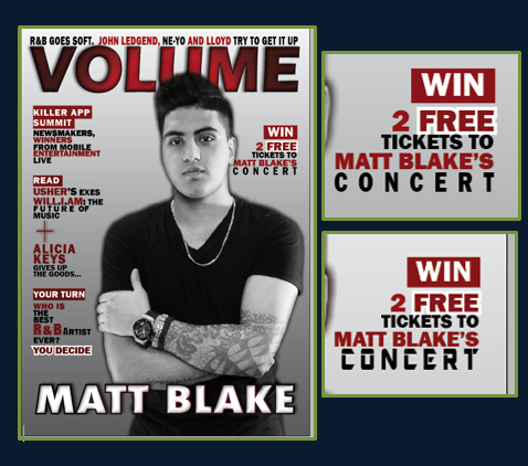
                 I decided on this layout because through my research on R&B double page spread I have seen my of them in this specific layout. This is an example of the similar layout that I will be doing. However the title be large some going on to the image side. The background will be very simple as I want the text to be read and seen easily. Another key convention is that the image needs to relate to the article written and this is what I will be doing. As I have already decided what my article is going to be about and from that I began to create and shoot my images. I have done this for all my image I made sure they all relate to R&B and the message I'm trying to get across. As the first thing the audience will see is the image, and this needs to attract them to read or buying the magazine.

After I got everything ready I can now start creating my background. I did this in the same way as I have explained it previously. I first started by taking the 'gradient tool' select the whole page, choosing the colour I want. Which are white grey and seen, I need bled it in the way I want (grey from the bottom going up to white. I choose this because it's simple allows the text to stand out and links to my other two pages. Screen shot two shows be select the file I need, in this case it's my image. I placed it where I want it to be using the rule measurements. I choose to create this image because it links to the interview I will be writing. The interview is about Matt Blake's (artist) new album. He reveals a few secrets about an unknown women he loves and his future plans with her. Therefore I created this image because the figure of the legs represent a women. However the face isn't shown because the interviewer and audience do not know who she is. Representing that there's a women but her identity is hidden. It also relates to R&B as women are normal begin objectified, linking to the theory of John Berger 'Men look, women appear'. As the man is sat where the women is walking towards him with part of her skin showing. 

This is an exciting example of R&B title and sub-heading. As you can see the masthead is bold and stand out instantly the page is open. I will be creating something similar as I want it stand out, but I will give it my own unique touch.Underneath the title there is a short sub-heading summing up what the whole article is about. I have seen this in many R&B double page spreads and other music genres. There I believe this is a convention I will need to follow. Therefore for my double page spread I will be adding a sub-heading to sum out my article. This will need to be placed straight underneath the title as viewer will need to read it first. This is also a convention I am going to follow, to allow me to produce a successful R&B double page spread.

I first began my thinking of and title and designing it. I came up with many different titles such as 'King of R&B REVEALS', however I decided to go for 'SEX, SECRETS AND SONGS' because this short snappy and it's a alliteration. This will enable the audience to remember it and will grab their attention instantly. It also follows the conventions as it needs to be short and relating to the article. It relates to the article as it's about love and sex is associated with love. For the word 'secrets' the artist (Matt Blake) will be revealing a few secrets and 'songs' relates to the whole magazine and article as it's talking about his latest R&B single. I find this title really effective and actually. Also it does not contain too much information, making the audience curious and want to find what its about. In terms of design I choose the font 'Impact' as I have been using this throughout my pages. It's bold and San serif making it easy to read and emphasising the R&B music has being hard and bold. I made the key word in burgundy as I need them to stand out. I keep the them of colours the same, as they are my house style. For the comma and word 'and' I made then in black as they aren't very important. I added a few effects such as drop shadow, inner glow etc. I done this in the same way as I explained it many times during my other pages. I made the shadow in the colour gold, because I want the double page spread to stand out a little and have something unique to the other too pages. I did not want to add to much colour but just enough to make it look a little different, but still relating to my house style and other pages. I chose the colour golf because this relates to R&B strongly, as they are associated with chains, having money and gold. This relates back to why I made my model wear and chain and necklace with a skull on it with diamonds. As R&B artist and listeners are into elements like this. Also my target audience are young people who love going out and money. I also played around with the levels of the letters (height, width and spaces). When I was done creating my title I moved on to coming up with a sub-heading. I came up with two different typography for the sub-heading. First one I made the whole text in black but the words 'partner, secrets and songs' in capital letters in the colour gold. This is because i felt like these word related to the three words of the title.
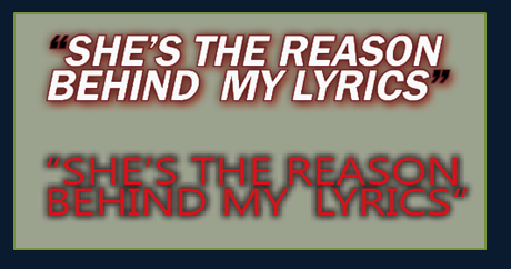
Partner = sex. secrets= secrets and songs = songs. I also changed the font to make  it stand out eve more and emphasises the importance if the words. The second one I made it little bit like a banner to make it really stand out and allow the audience to read it first. I made the background black with white text. I added ellipses to make it more extreme and create a feeling of curiousness. At the bottom I need made the sentence 'no face shown' in capitals in the colour gold. This is because I wanted this part of the sub-heading to be important and stand out. The font I choose is Agency FB. At the end I decided to for the second typography design because I didn't want to repeat my self as it was very similar to the title, and the sub-heading is meant to give a little more information about the article. Therefore by making the 'no face shown' the important bit the audience will know there is something to do with identity relating back to the main image. These to screen shots on the side show how the double page spread looks after I have placed them in the correct place. 
 For the start go by double page spread I'm going to making the first letter big as seen through these two R&B double page spread. Depending on the design and which looks better with my layout I decided whether I will make it bold or curvy. However just looking through these examples I kind of like the curvy one, but I will still experiment. For the paragraphs I will be making the paragraphs justified with last line alignment left. As this will make sure everything is in line together, making it easy to read and the audience will know where to start from next. I will be making sure I use I have used some techniques that I have learnt throughout my research to improve the language as well as interest and attract the audience. I will make sure there is not grammatical mistakes and I use many techniques. 
In these screen shots I am going the process of me developing my double page spread and adding the interview that I ave written. I first started of my adding a short introduction about Matt Blake and his career. As I have seen all double page spreads including an introduction to began with. After placing everything using the alignment lines to help me make sure everything is straight. I then started to experiment with what font to make the first letter. I made it first bold in burgundy colour. However I did not like it as I felt like it was too bold and squashed together. Therefore I then made it curvy, which I really liked it, therefore I kept it. For the font of the text I made it 'Calibri' as it's a sans serif font. This makes the writing simple and much easier to read as there's a large amount of text and the audience need to be able to read it quickly and easily. For the size I made sure it's not more than 12pt as through my research the most it goes up to is 13pt. This is because 14pt and above is to big for a double age spread. I kept the font the same though out. However for the questions I just made the colour different, so the audience will see it easily and be able to tell when the next question starts.  I also made sure the paragraphs are in cloumns as through my research all R&B double spreads the paragraphs are layout are in columns. I finally used the alignment lines to help me place it in the correct place.

Monday, 18 April 2016

Process of creating CD cover

This is the process of manipulating my image and creating the CD cover.


Stage 1: First I began by manipulating the image. I began by copying the tattoo from the front cover image and placing it on to his arm on this image. As you can see I used the 'polygonal tool' to help me select the area I don't want, then when pressing on 'select', 'Inverse' it will automatically do the opposite thing and select the other areas and keep the hand (part I selected), in which I will be placing the tattoo in. After I adjusted it and curved it around his arm until it was perfect and looked real. I then copied the second tattoo and placed it on to his another arm. I did the same thing adjusted the size, rotation and placement until I found the correct place. I done this my pressing 'Ctrl T'. 
Stage 2: When I finished with the tattoos I then moved on to removing the background. I do this in the same way as my previous pictures. I used the 'polygonal tool' to select the areas I don't want and then done Inverse so it selects the other areas such as background. I done this because it saves a lot of time. I then used the 'Eraser tool' to rub out the area I selected. However I still had the thin parts around the image. It was difficult to see so for that reason I placed a black layer behind the image. As this enabled the grey background to really stand out and therefore it was easier to see and eras. I also needed to zoom in to make sure I do not rub and parts of the body. It took me quiet some time as I wanted it to be prefect.
Stage 3:When I was done removing the background I then smoothed the models face. Now I was done manipulating the image and could start creating the CD.
Stage 4: I now placed the background that I need as seen through the video. I then added the text and added effects to it. However this was not shown due to the program I was using. But you could see how the text have changed due to adding inner glow, shadow etc. This was the final part of creating my magazine. Now I need to move it into InDesign. 

Final outcome of my CD Cover


Thursday, 14 April 2016

Analysing my CD cover and existing R&B covers

While I was manipulating the image for the double page spread, I thought about creating a side cover for my double page spread. This is because in my double page spread the article is going to be an interview with the artist on my front cover and contents page and about his latest album. So for that reason I decided to create the CD and place onto the double page spread as it will link perfectly with the article. Not only that as I have seen in other music genre magazine they give out free CD's, however in my genre I am unable to do this because none of the R&B magazine do this. It is also a convention of an R&B magazine that I will need to follow. Therefore by doing this I would be able to create a CD for my audience to see but at the same time I won't be going against the conventions. 


Here are some examples of R&B music album covers. I will need to create something very similar to this as these are how R&B music albums usually look like. This will also link to the theme of magazine as the colours are burgundy, black and white, and the background this white and grey. Therefore doing something sim,liar to this will also link to my theme as it's black and white which is the same as my images. In terms of image that I will be using is the image I was going to use for my front cover (shoot 1), but I did not. It is the prefect image as through some of the research I did album images look very similar to the image I took. It is also in black and white therefore relates to the examples above and my theme.  As seen through these albums there isn't any specific font or colour used it depends on the lyrics and what the lyrics are about then the name will be designed in a typography that goes with it. The designing is fairly simple, this is similar to what I am going to be creating. 

Wednesday, 13 April 2016

Final stages of Construction - Contents page

This is the final stage of the process of me creating my contents page.
These two image are R&B contents pages, the way I will be placing my text will be in a very similar way. I will be following this way of placing my information because it is very simple, which is easy to read and understand. Also the design and layout if features are very similar. Therefore following an exciting R&B magazine and changing it a little bit into my own way will enable to produce a successful and unique contents page. As seen through these two example and my previous example that I analysed and posed. None of the contents pages included an reviews category, I believe the convention is only including features and some fashion pages as I have seen a few R&B magazine with fashion pages. However I have decided to include it in mine because in my survey analysis my target audience where interested in reviews. So for that reason I decided to create a very small section on reviews as this will enable me to please my target audience and I wouldn't have gone completely against the R&B magazine convention.  

These screen shots show what I have developed in my contents page. I have added a few pages on what my magazine will include. I did not have difficulty writhing this up because I already planned what I was going to write from before. So it was very quick and easy I just needed to decided on a font and colour. For the number I made the white and the heading of the page next to it in burgundy. I just the font 'impact' again as I want it to be consistent and to stands out against the background. As I believe this is the best simple bold font. I decided on these colours because they go with the colour scheme and stand out against the background therefore is to easy and read. I then made the rest of the text in black to start off with, but after looking at it carefully I that it doesn't really look that nice and it quite difficult to read therefore, I decided to change to white. One problem was that with the white font and grey background it was still little bit hard to 

see. So for that reason I decided I should add a drop shadow and spread it a little bit out. As this will give it a black fade behind it, making it a lot easier to see. I tired it and it worked, therefore I carried on with making the rest of the text in white. When I was done decided on the main features everything else which much easier to do. Again I made sure I use the alignments lines to make sure I place everything in the correct place. The screen shots above show the process I have just explained. These screen shots on the left shows how I have developed it further by adding more information on the pages. I did the same process for all the text. 
Here I finished adding all the information for the pages. I did the same process as before. I also added the page number at to bottom. I added it in black because white wouldn't stand out or be shown against a white background. Also on the top left of the page I added the masthead name as most R&B magazine have included this in the same place. Therefore I will need to follow this conventions and place it in the same place. Even though I feel like the contrast with the title doesn't look very good, but its not about what I prefer it's about the codes and conventions of an R&B magazine. As always I used the alignment lines to adjust the the placement and make sure everything is placed in the correct place. It also enables me to makes sure the space of the right hand side is the same from top to bottom. The text does not go over the edges.  

Friday, 8 April 2016

Early Stages of Construction - Contents page

I am now starting to show the process of creating my contents page.
First I started of by making the background on Photoshop placing with the image and then I will move the background and image both onto InDesign. I first started of by selecting the 'gradient tool' making a box the fits perfectly on top the whole page. I then created a new gradient and selected the two colours I want to blend in together, which are grey and white. After this I then used the gradient tool to make a line across the page as seen in screen shot two. This will enable me to choose how I want the two colours to blend in together. I am going to make the top part grey and then started getting lighter into white. I did this because these two colours will go best with the image and will follow my colour scheme. It will also enable the text to stand out as the background is a little darker a the top. I the used the 'T' (Text) tool' to type up a V. This represents the name of the magazine. The font I choose is 'Eras bold' which is the same as the one I used to create the masthead. This is consistent and bold. I have seen an R&B magazine do this, which I got the idea from. It is useful as it allows the audience to familiarise themselves with the name, cause as soon as they see it they will think what the V represents and realise it's the name of the magazine (Volume). When I finished doing this I then changed the opacity of the V as I didn't want it to be that bold. This is because it may distract the audience and the text won;t be easily visible.
When I was done creating the background I just needed to place the image of the artist which I did. Now I can place the full image onto InDesign, which is show through the next screen shot. I done this by going on 'file', 'Place' and then selecting the image from my files. 


To begin with I adding the draft of my contents page layout side by side with the InDesign page. This is so I have a clear understanding of which features are going to go where. It also helped me insert
the Alignment lines. This is will enable me to make sure everything is positioned correctly, neatly and not all over the place. The first thing I need to do is create the title of the contents page. Therefore before doing this I made sure I looked at a few R&B contents pages that I researched on already before just to make sure I have the prefect idea on what design I will creating, this will be less time consuming for me as I won't I have to create many designs. The first contents page is one of the R&B designs of a contents page, however this is not the one I am following or will be creating a similar one to it. I am only using it in order to look at the design of the title. The second contents page design is the same to the one I want to create. As I have planned this from before while I was doing my research on contents pages. This is only a recap to make sure I do not miss out any key features. Even though these to are totally different magazine however they both have similar title design, which is bold with no serif on the font. Therefor the design that I will going for in terms of title the design that I am going for is bold and simply this is because it follows the codes and conventions of an R&B magazine and also relates the theme of my magazine. 

This the design of the title for the contents page that I will be using. The font that I have chosen is 'Impact' this is because it is consistent as I have used it in my front cover. It's also bold and stands out a lot. It is also a San serif font, which relates to R&B as it has bold and strong edges. The colour I went for is burgundy this is because again follow the house colour of my magazine, it also goes really well with the heart on the image, which contrasts together. The letters are in capital as through my research all R&B and most of other music genres had their title in full capital letters. This emphasises the boldness of the magazine and again makes it stand out, it is also a convention which I had to follow. When I finished choosing the font and colour I then started to add effects, as I do to most of my really important text to make them look bolder. The last screen shot shows the effects which were available that I could use. I added a black shadow, inner shadow and outer glow to create this professional R&B contents page title. I did not want the title to go all the way across the width of the page because it did not look very nice. When I was done editing it I used the alignment lines to help place it in the correct place. I the moved on to creating the sub-headings 'Features' and 'Reviews'. I made them white in the font 'Impact' I chose this for the same reasons I mentioned before. I didn't change much with this I just added a shadow and increased the noise a little to make it have a texture and sharp, relating to R&B. Underneath both sub-headings I added a burgundy line to make them stand out a little more and this also emphaises they are important as its underlined. I also use the alignment lines to place them in the correct place.

Wednesday, 6 April 2016

Final stages of Construction - Front cover

This is the final part of my development for the front cover. 
In this screen shot I am showing how I have added the final cover line, pull out quote and adjusted a few features. In terms of the final cover line I have followed the same pattern as my previous one. This is because I want everything to be consistent, professional and not too busy. I stared by making the word 'win' as the sub-heading in order to attract my target audience, as they are able to get something for free which most my target audience where interested in. I found out this through the survey I conducted. I decided on making the feature that the audience win is 2 free tickets to Matt Blake's concert because he is the central focus of the magazine. This is because he is on the image for the front cover, contents page and cover story is about him. Therefore the people who are going to buy this magazine will need to be fans of Matt Blake as most of the magazine is about him. I also made the word 'Free' bigger and bolder by adding the white stroke, the same as the previous cover line I did. I decided this word was one of the important words because as soon as the viewer see's there is something to win or free they are more likely to approach it. I know this because through the survey I conducted one of my questions asked whether a free CD or any other free feature will enable them to want to buy the magazine more, and most of my target audience said yes. However, I could not include a free CD because none of R&B magazine had this feature included. Therefore I will need to follow the codes and conventions. But at the same time I wanted to please my target audience and give them the best possible magazine that meets their needs. So for that reason I decided to add something that will enable my target audience to engage with the magazine, which I came up with the following cover line. I also made the word 'concert' bigger and added kerning to it because I also want it to stand out, as my target audience are young people who like to party and go out. Adding the kerning will enable them to read it carefully. It also looks good as the name of the artist is right at the top placed on top of the word concert which makes it related to each other and looks nice. At first I was planning to make the font different as well to give in more importance and will stand out against the rest of the text. However, I changed this and kept the font the same because I remembered I needed to follow the convention of an R&B magazine which is not to go over maximum of 3 fonts. The top two screen shots show how it was before and the bottom two shows how I changed it and made it the same. The last screen shot is a zoom in of what I added. As seen it looks a lot more professional as the font is consistent throughout.


I first started off by coming up with different pull quotes I could use. While thinking I had to keep in mind the quote I will pick out I will need to be able to use it when it comes to creating the double page spread. I came up with many different pull quotes however I then picked the top one which I liked the most. I then began to design the pull quote in a way which will suit with my scheme and it will stand out at the same time. I designed many different once and then picked my top two. The first one I made the inside white, with a very thin burgundy stroke and a lighter burgundy shadow. This is because it really brings out the text, making it stand out against the background. I also decided to make it white because the white colour emphasises importance of the text, as I have only used white for the very important features such as main cover line. For the quotation marks I had them in black but same stroke and shadow as this follows the pattern I have been doing for my cover lines, but in different colours. I added these features by going on the 'object' category and clicking o effects which will give me many different features I could use and add to my text. In terms of font I choose the 'Franklin Gothic Demi' which is the same as my other cover lines, I didn't want to use a different font because the key convention of R&B magazine is not to use too many fonts and make the front cover too busy. I also like this font because it is bold and doesn't have serif which is professional, basic and easy to read. I first started off by coming up with different pull quotes I could use. While thinking I had to keep in mind the quote I will pick out I will need to be able to use it when it comes to creating the double page spread. I came up with many different pull quotes however I then picked the top one which I liked the most. I then began to design the pull quote in away which will suit with my scheme and it will stand out at the same time. I designed many different once and then picked my top two. The first one I made the inside white, with a very thin burgundy stroke and a lighter burgundy shadow. This is because it really brings out the text, making it stand out against the background. I also decided to make it white because the white colour emphasises importance of the text, as I have only used white for the very important features such as main cover line. For the quotation marks I had them in black but same stroke and shadow as this follows the pattern I have been doing for my cover lines, but in different colours. I added these features by going on the 'object' category and clicking o effects which will give me many different features I could use and add to my text. In terms of font I choose the 'Franklin Gothic Demi' which is the same as my other cover lines, I didn't want to use a different font because the key convention of R&B magazine is not to use too many fonts and make the front cover too busy. I also like this font because it is bold and doesn't have serif which is professional, basic and easy to read. 

I also adjusted a few features which InDesign allows me to do as seen through this screen shot. One of these features was to make my text Italic I made it 12 degrees tiled as I didn't want it to be too much cause it will then be hard to read. So I decided to make it a little bit to emphasis that this quote is said by someone which is the artist as I have placed it underneath his name. Furthermore, I adjusted more features such as making the litter a little wider as seen in the screen shot about.  


The second pull quote I designed it in the same process effects and features, however different colour and font.The font I picked for this one is simple very simple and thin. The colour is bright red as this makes it stand out against the background and all other cover lines. I added a black shadow so the red colour doesn't look to bright and ruins the colour scheme. Overall the one that I liked most is the top one because it looks a lot similar and goes more with my colour scheme. It also has the same font as my over cover lines. The top one also follows the conventions of an R&B magazine a lot more than the second one. Therefore I will now be placing that one on my front cover.
The firsts and second screen shot shows how the magazine looks after I added the final cover line and pull quote. The third screen shot shows a zoom in on the pull quote added on my front cover. 


In this screen shot shows the final touches that I added to my magazine, such as the barcode, price, issue number and adjusting the text just to make sure the sides are symmetrical and everything is placed in the correct place. As seen through screen shot one I kept adjusting the text and adding more rules to make sure the sides are symmetrical as this is important in order for the magazine to look professional.I also made sure I kept the right amount of space at the top of the page between the skyline and end of the page. As through R&B magazines they didn't have a large amount of space, same goes for the bottom. I also kept all the cover line after each other because I have seen this on R&B magazines it is also neat and the cover lines aren't all over the place and don't go over the image. Except for the main cover line, but doesn't take up too much or the central parts. I placed the issue number underneath the masthead because this is where I have seen it being placed on the R&B magazines. Therefore I have to follow this convention in order for the audience not to be confused as they are used to seeing it in the same place. The colour I decided to make it is black because I don't want it to ruin the masthead or take away the focus. Therefore making the colour dark will keep it simple and won't stand out a lot. As for the font I made it the same as the cover lines because I didn't want to use too many fonts as I mentioned before. In terms of barcode and price I placed them at the bottom of the page. As through my research I saw all R&B magazines placing the barcode and price at the bottom on the right or left depending on the space available. As a case of mine I decided to place it side ways up, at the bottom on the right side of the page, with the price underneath. The price and barcode need to be together when it comes to a magazine. I decided to place it on the right side and not the left because it ruins the text above and may distract the audience therefore I decided to place on the other side as its empty. The colour I used for the price is black in the same handwriting as all the other text, keeping is simple and neat. 

Saturday, 2 April 2016

Continued Stages of Construction - Front cover

Now I am just continuing the development of my front cover. 

When researching into how my front cover would look and what typography and colours I will be using for my cover lines, I noticed that most R&B magazines use maximum of 3 to 4 different fonts and only 3 different colours, when coming to their cover line designs. As seen through these two R&B front covers the first one only uses 2 different font and 2 colours. The second one also uses only 2 colours and 2 different fonts. However, they play around with sizes to emphasises the importance of each word and to grab the audience attention, so that it is not to plain. Therefore this is a key convention in an R&B magazine that I will have to follow while creating my cover line designs. I will not be using more than 3 different fonts and colours and will keep differently play around with the sizes to emphasises each word. I will also be adding a skyline as some on the R&B magazines use this, as seen in the first example they have used it, but in the second they haven't.Therefore this depends on the magazine and what they want to do for each issue. In the next screen shot I will be showing how I have developed my magazine further by starting to add the cover lines. 

Th first feature that I added to my front cover next is the skyline. 'R&B goes soft, John Legend, NE-YO and Lloyd try to get it up' I have explained why I have chosen this specific skyline in my previous planning post and for all my other cover lines, therefore I won't be going to that again. However, I will be explaining why I have chosen this design, typography and colours. As through my planning I decided on making my colour scheme black,white and burgundy because I found out my target audience preferred dark colours when I created my survey. Also the key convention is not to make the magazine too busy and stick to maximum of three colours. First I decided to swap over between black and burgundy because white wouldn't stand out a lot against my background and as I mentioned previously I wanted the main cover line to be the only white text so it really emphasises it's importance. Between each section I change colours, this shows the audience its a new start and adds a nice theme and design to the front cover. I have also seen many different R&B magazines do this. For example, 'R&B GOES SOFT' black then 'JOHN LEDGEND' burgundy because its a name separated from the previous text, then 'NE-YO' another name therefore different from the previous next and I have repeated this pattern. It also makes the text more attractive and better than plain and same colour throughout. The font I used is 'Franklin Gothic Heavy' this is because it is a simple, easy to read and bold font. As R&B magazine normally have bold text as this relates to the type of music which isn't soft. 

I have added a screen shot of how the front cover looks with the measurements, without and a close up of what I have added. For my two cover lines that I have added I first made the top part a different font and bigger size because I really wanted to emphasises the importance. However after analysing it properly I decided to change it because I felt it wasn't very professional and I didn't want to go over using 3 fonts. So for that reason I decided of thinking of different ways I can make the main mart of the cover line to really stand out and shoes the audience that this is the more important. After I did my further research I came up with giving it a kind of highlight. So I kept the font the same which is 'Franklin Gothic Heavy', but I made the size a little bigger. The colour is not white with highlighted burgundy this doesn't take away the attention of the main cover as it is way bigger, but still shows it is an important feature. I did this through using the 'T' tool to add a text box and then coloured the box it with the effects that InDesign provides me with. For the rest of the text, I repeated the same technique as the skyline as I didn't want the cover to look too busy. I the did the same technique and design for the next cover line. However I made the names if the artist a little bigger but not bigger than the highlighted part. This is because I want their names to stand out as their fans and my target audience will approach it as they are famous R&B artist. I also added kerning to the word 'Future' this is because I want it to be read carefully and future is represented as time and the space indicates time and long distance.


In these screen shots I am showing what I have developed in my front cover. Now I have added more cover lines. First I have added a little bit more to the second one. I have added a plus sign (+) this so the audience are able to tell that the second and third cover line are linked together. It also adds the tension as it shows there is still more. For the name of the artist I made the size bigger so it stands out and grabs the attention of R&B audience. I made this burgundy because it links back to the second one, the names of the artist are in burgundy and description is in black. So I did not want to confuse my audience therefore I kept it the same. After I added the short description I finished it off my adding ellipsis this creates a feeling of curiousness, which will makes the audience want to buy the magazine in order to find out what this cover line is all about and what story behind it is. The bottom cover line follows the same pattern, design and font. However, for the words who, best and ever I made them slightly bigger to show they are important, but for the word R&B I changed the font into 'Impact' this is much more bolder and I made the size bigger. This is because its the main feature in this cover line and I want it to stand out. It also links to the genre of the magazine, which is important. Right at the end I added 'You decided' with a white stroke because I want the audience to see it and show them they can interact with the magazine and give their thoughts. But I wanted to make it stand out in a different way, which still links to the theme. Also the title of the cover line 'Your turn' emphasises this as again. The use of question also makes them interact with the magazine as this makes them think. I made the letters capital for all the coverlines because this makes them look bolder and easier to read. It also links to R&B magazine I have see most of R&B magazines use capital letters for all their cover lines.