Early Stages of Construction - Front cover
As used in my preliminary task, I am using a desktop publishing program to create my front cover, contents page and double page spread, namely InDesign. I have some experience and skills using InDesign, which I picked up when producing my preliminary task, which I can develop further while creating my music magazine. The following screen shots will be showing in detail, my exact journey through the process of my creating my front cover.

As seen through this first slide I am showing how I have developed my image further after I finished manipulating it on Photoshop. I started of by inserting all the measurements on how big and the specific size of my front cover page, as seen through the first screen shot. This will ensure that everything I placed onto the page will be shown perfectly and nothing cut out. As the size is the same to a normal magazine front page. Now that I have made sure the size of the image is correct I can move on to inserting my image. I done this by going on the 'File' category at the top of the program and clicking on 'Place'. This will then instantly transfer me to my file in order to pick out the image I want. I then had to adjust the size, so it fits the page perfectly. When I completed this process I then moved on to adding few more effects to my images. This is because I felt as the image was too flat on the page and didn't have anything to make it stand out and look more bold. So I started of by selecting on the object I need (image) going on to the 'Object' category then 'effects' as shown in the second screen shot. I then got a pop up of all the effects I can add to the image, seen through screen shot three. I added a shadow and outer glow, I kept experimenting with the different levels, size, distance, spread and all the features until I found the prefect one. This contained of only adding a black shadow and outer glow as I mentioned previously. This was the best because it wasn't over done or too busy. It kept its simplicity but yet made it stand out a lot more and removed all any hard and sharp edges. I also saw this added in some of the R&B magazine, at first I did not understand what the exact reason behind the shadow is, but now that I have done my further research and decided on using it I really found it effective and useful. Therefore I will be considering using it when it comes to creating my other pages. The lest screen shot shows the final out come after adding the shadow and outer glow. As I said making the image stand out, bolder look and removing any hard texture, which I gained after cropping the background.

Now that I have definitely finished manipulating the image. I can start creating the background. At first I was planning to keep by background a plan colour, as I didn't want my front cover to be too busy. This is because through my research on R&B magazines most of the backgrounds I saw were very simple colours. However, I did not like it to be one colour as it wasn't very attractive or visually pleasing and didn't bring the image out. So for that reason I cane up with adding two very similar colours and blending them in together. To do this I started of by adding a gradient box and fitting it across the whole page, as seen through screen shot one. Then to get the colours, I had to go on 'swatches' right click and selecting 'new gradient' which give be a pop up with different colouring techniques that I could experiment with in order to find the colour I wanted. After I experimented through many different colours the best one was grey and white. This is because it looked good with my image and I had to bare in mind that my target audience preferred dark colours and not bright. I also needed to make sure I pick a colour that will match my masthead and colour scheme which is (burgundy, black and white) and these two colurs suit best and won't make the front cover too busy. Screen shot one shows how I have decided to blend the two colours together. Screen shot four shows how it looks with the image and five how it was before. Overall I find it much better and more attractive than the plain white.

After I completed adding the background colour and central image I needed to know where I will be placing each feature. So I placed my layout draft and my InDesign page side by side in order for my to easily refer back, as I have shown in my first and second screen shot. To help easily place everything in the correct place and won't be time consuming for me I decided on adding alignment lines on my page so as to recreate the approximate shapes of each feature. I simply did this by dragging the line across from the margin rulers, and using the rules, I was able to create margins for my self that would keep my features aligned together. This is essential because is will enable me to produce an effective front cover as it attracts customers more so than an unorgainsed one.Using the measured lines as a guide, I readjusted the placement of my central image. I decided on place it en the centre but more towards the right because this will enable to have a lot more space to place the cover lines, it also looked visually better. I also made sure it is big enough in order for it to stand out and attract my target audience instantly as this is the center of visual interest. I then inserted my masthead which goes above the central image, so as to accentuate that this is the title of the media product, which conforms to the codes and conventions of magazines form my research. I also made sure it spreads out across the width of the cover, to further emphasises its importance. I have decided to place it behind the models head because this suggests that the magazine is rather well-known as readers are already able to recognise the magazine, without having to read the masthead carefully. Before deciding on this I also made sure I have followed the conventions of the R&B magazines. I have shown some examples of R&B front covers which have used the same technique.

Billboard and Vibe magazine have done the same thing and this is where I could my idea from. I noticed that the first and earlier editions of the magazine would generally have the object behind the masthead, this is to allow the audience to familiarises themselves with the name. However, through later editions I have the noticed how this has developed by having the image at the front of the masthead. As the magazine have become more popular and successful.Therefore I wanted the target audience and other people to see my magazine in such away, and this is why I had done in like this. It also look more visually pleasing to the eye.In terms of the colour for the masthead I have decided on making fade from dark burgundy in light towards the center as I found that makes the masthead look a lot more attractive and grabs the audience attention. I took this ides from vibe magazine as they do they sometimes, as seen through the first image. I have done into more detail about what I did and why I deigned my masthead in this way in my previous posts. The way I designed it is the same process as my other text and image. Which is through adding effects, just how I have explained it at the start for my image.
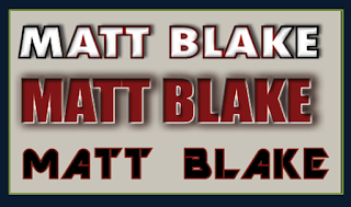
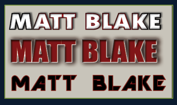
Moving on to the main cover line at first i decided three different cover lines because I was unsure about how to make it what colours to use. Therefore I created all the ideas I had in mind in order to see it visually and see which one looked and suited my magazine best and target audience. After experimenting with many different features and deciding on which one to choose I finally chose the first cover line design. This is because I found that it is the most suitable for R&B, suits the theme of my magazine best easy to read and stand out. As the second one is very plain, too bold and the colour wasn't that good. This is because e my cover lines are going to be burgundy and black as I have planned from before. Therefore I need to add another colour in order for it to really stand out and grab the audience attention. As for the last one when I placed it on to my magazine the burgundy out line didn't really show and as I mentioned my cover lines are going to be same colour therefore I needed something different but still links to my colour scheme in order for it to stand out. It is also a little difficult to read from far and audience may mistake the name to a different artist. So for that reason the first was the best as it is a different colour which adds importance because none of the other text is the same but yet still links due to the stroke of black and burgundy shades. I created these in the same way as how I added effect to my image. I decided on placing it on bottom centre of the magazine this because this is the post space available as when I was taking my photo shoot I planned it to be like this. I took this idea form my research on R&B magazines as they all contain a main cover line by place it in different areas that has the most space. As see in the vibe 'kesha' front cover I have done something very similar to that. The codes and conventions is to have a main cover line however where you place it isn't very important as long as it really stand out and attracts the audience, and where I have placed it is the best and most attractive place for the audience to see it. I have gone into more detail on these conventions in my previous posts. On the top third screen shot shows how the front cover looks when I have insrted the masthead, centre image and main cover line.


No comments:
Post a Comment